The PFCA
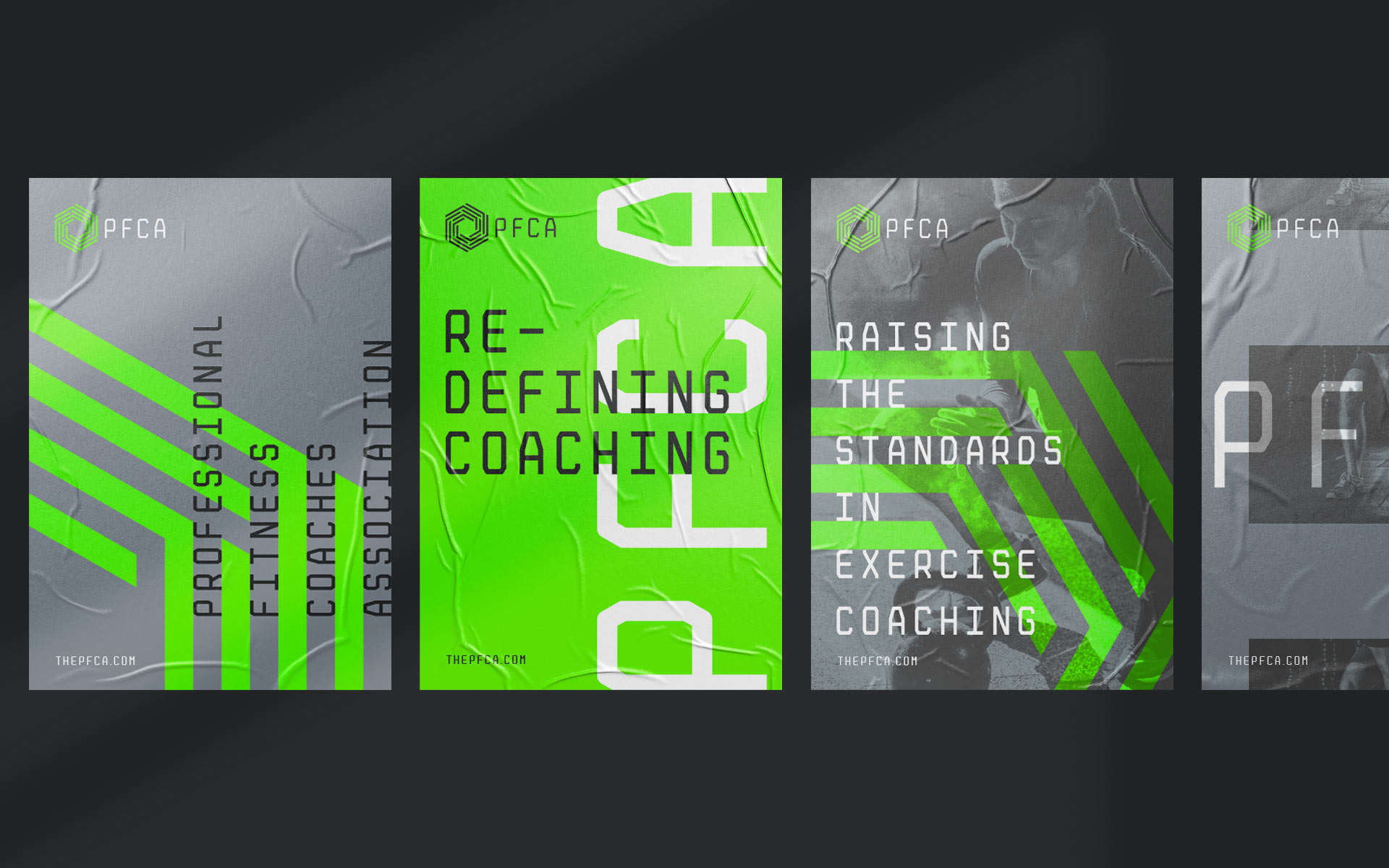
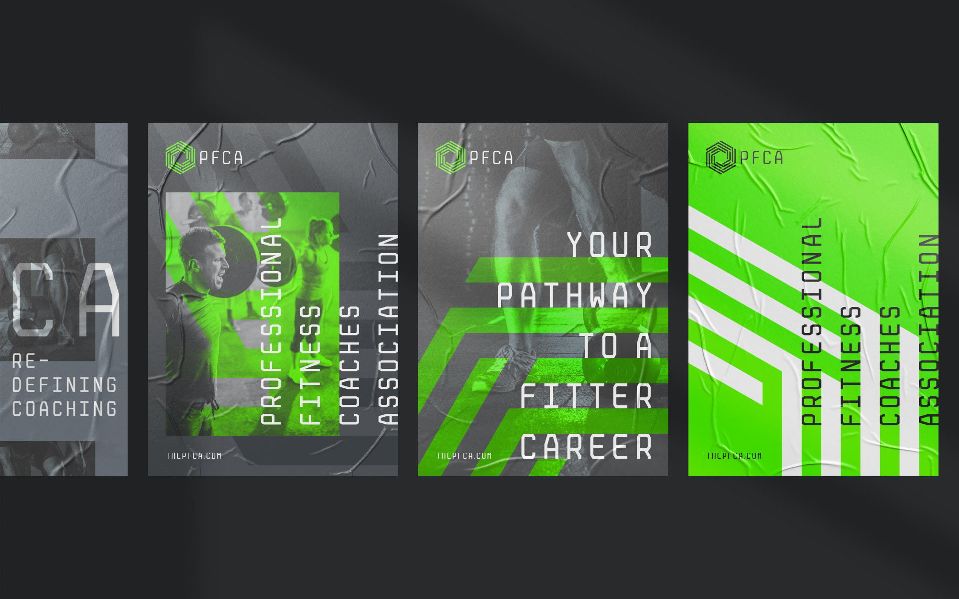
Raising the bar of fitness coaching
Branding the providers of the most forward-thinking professional development programme in the UK fitness industry.
- Client:
The PFCA - Completed at:
Studio Fury
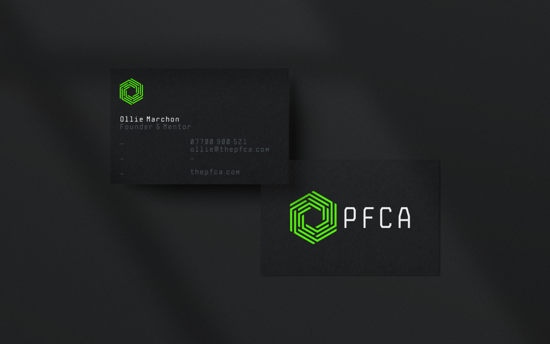
The identity is based around the concept of a central hub – a hive of knowledge and learning. The core symbol is made up of 4 interlocking layers to represent The PFCA’s 4 core pillars (Business, Lifestyle, Self and Training).
Additionally the negative space in these layers can be viewed as a set of pathways – practical routes to being a better coach.
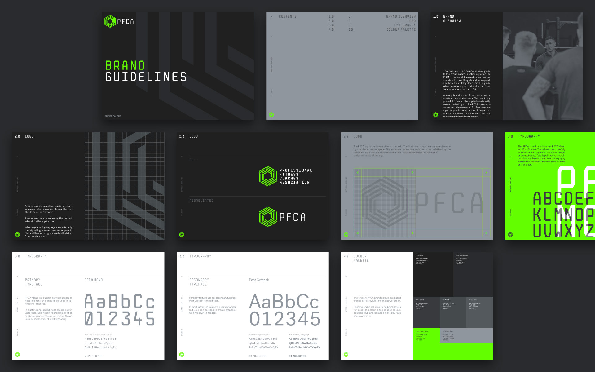
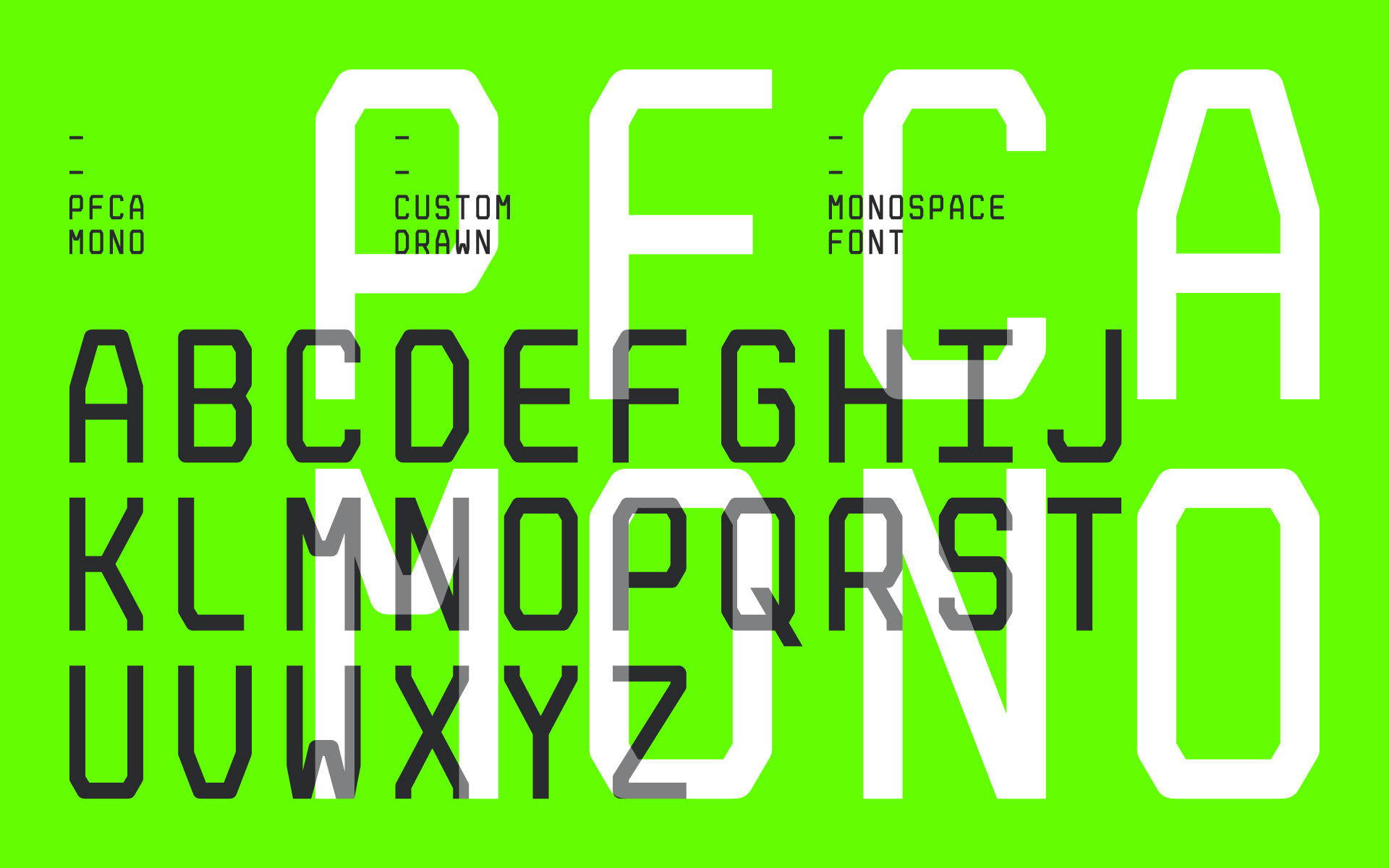
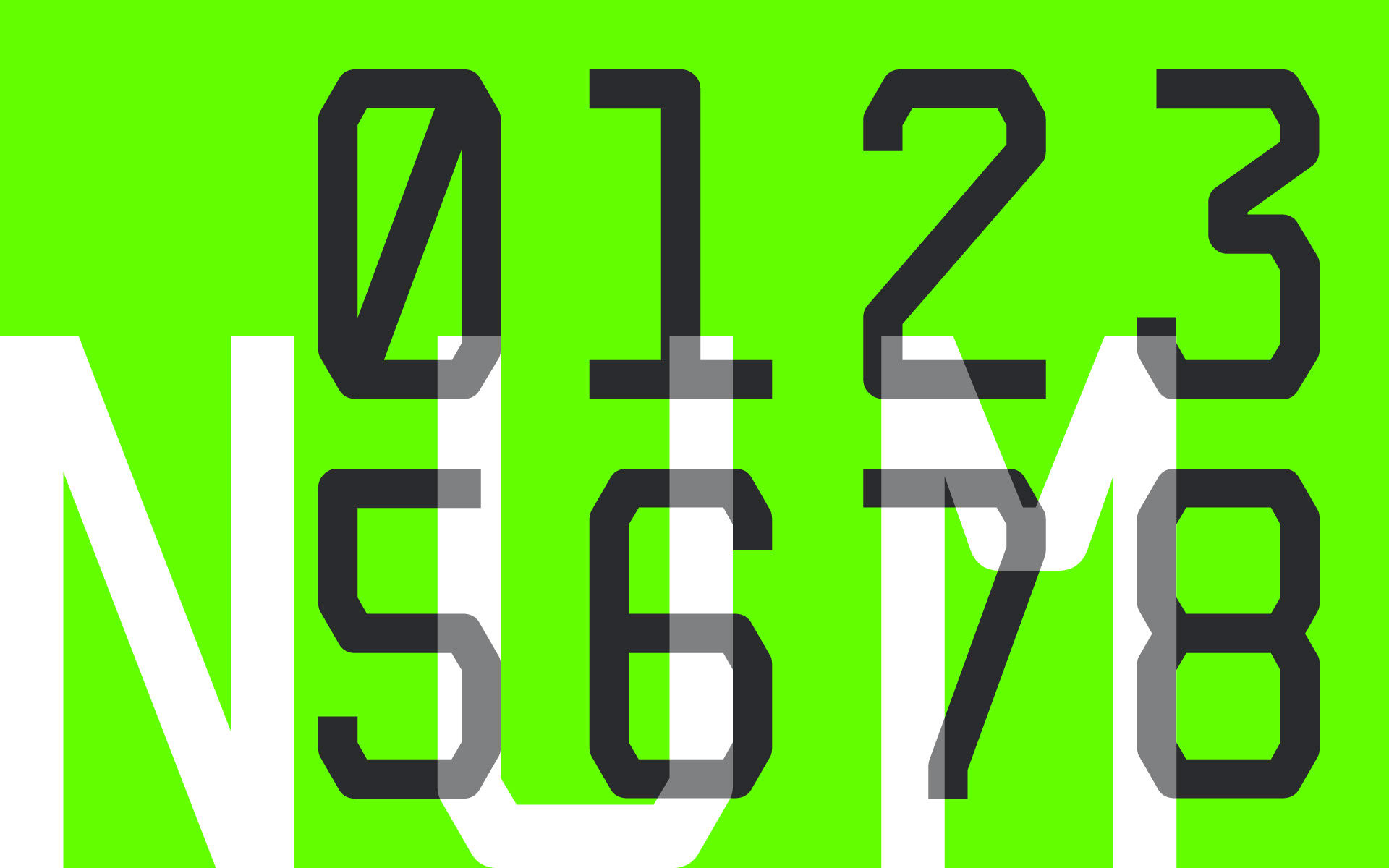
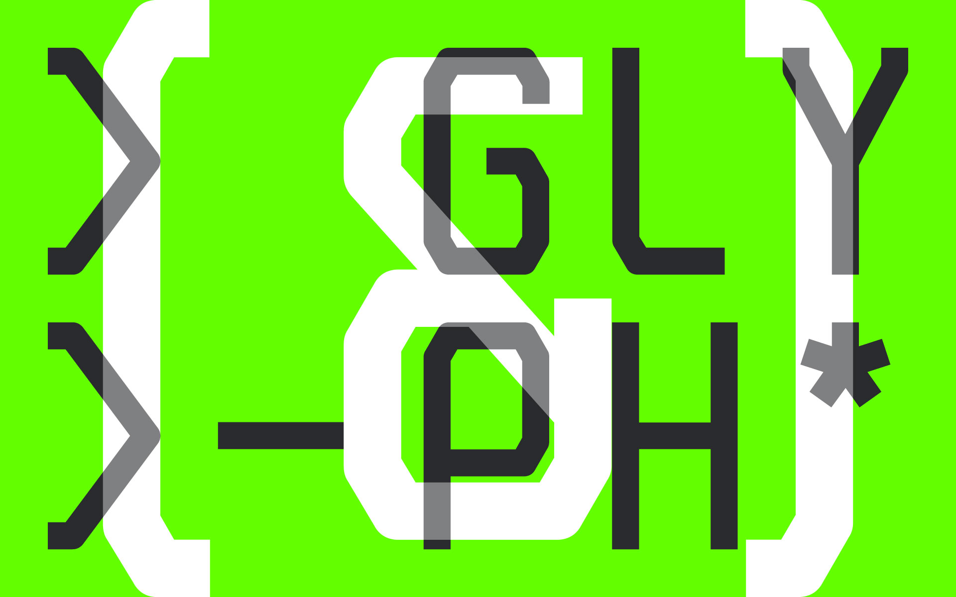
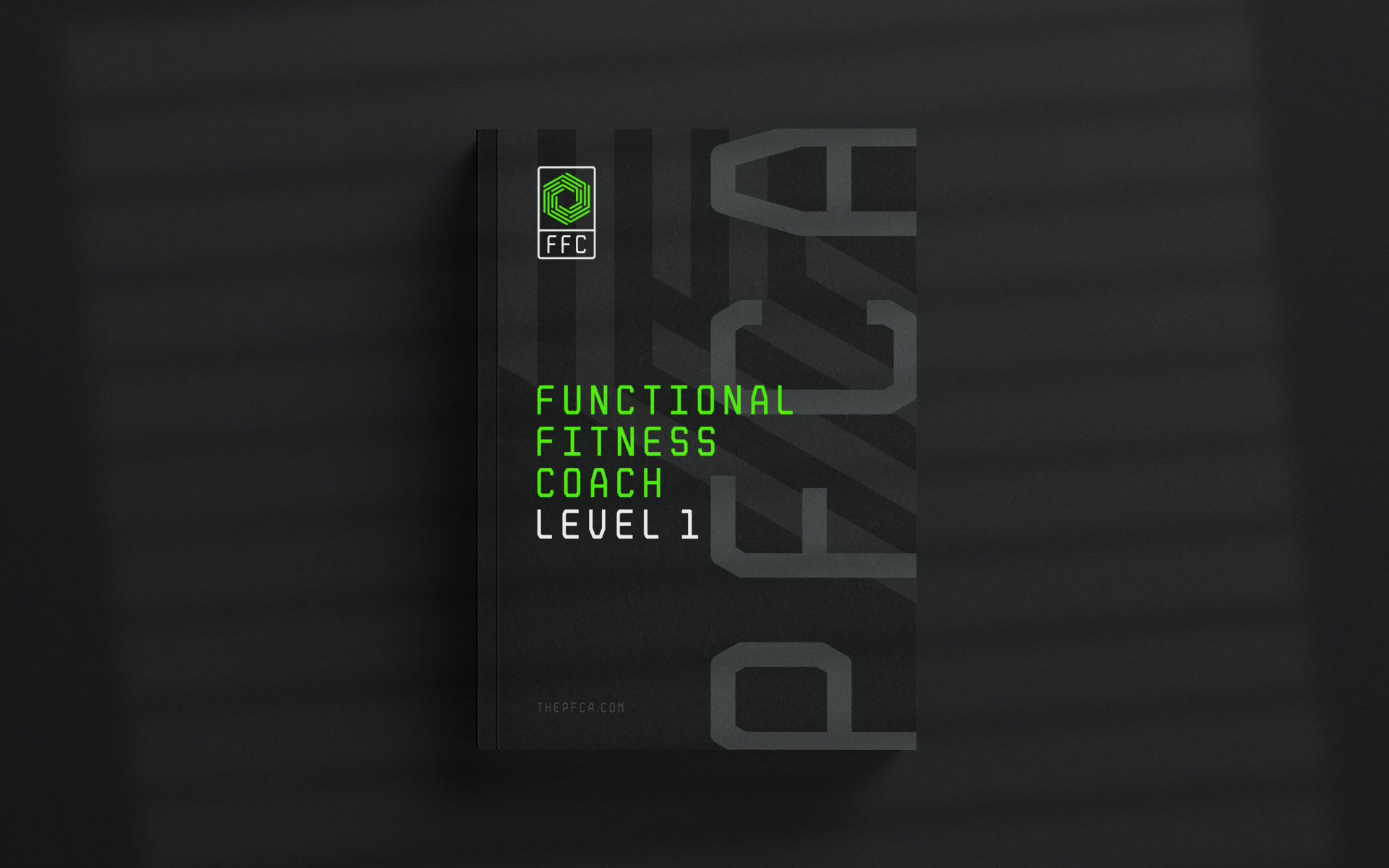
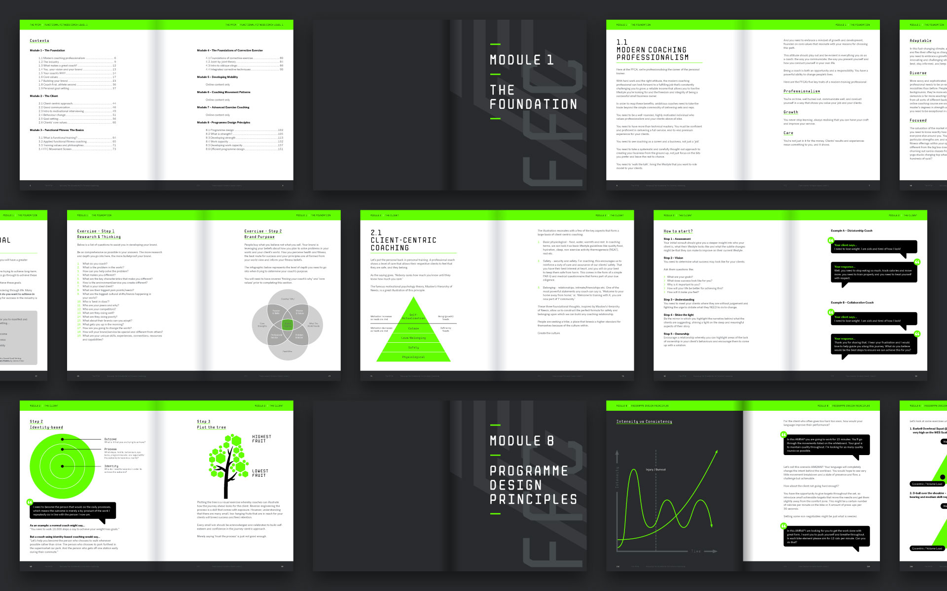
PFCA Mono is a custom drawn monospace headline font that is used heavily throughout the branding. The typeface comes complete with both upper and lowercase characters, a full number set and glyphs.

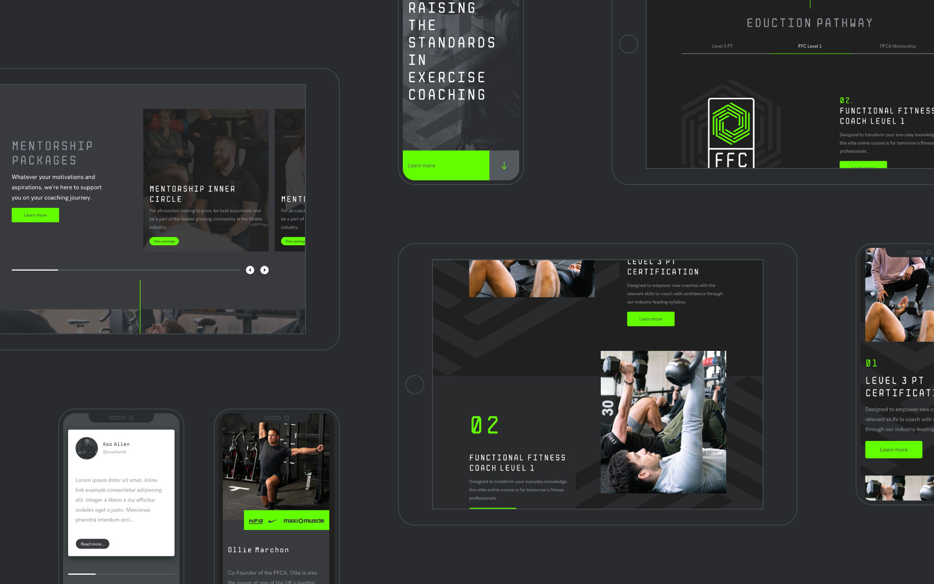
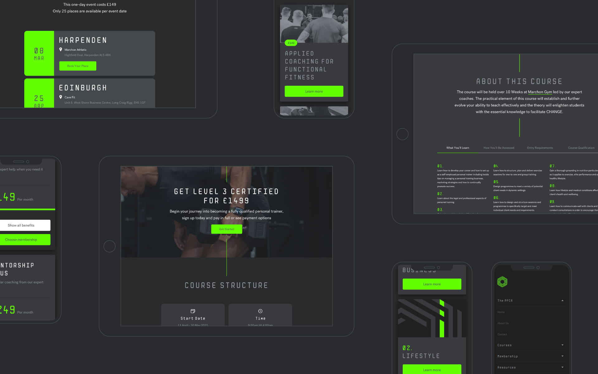
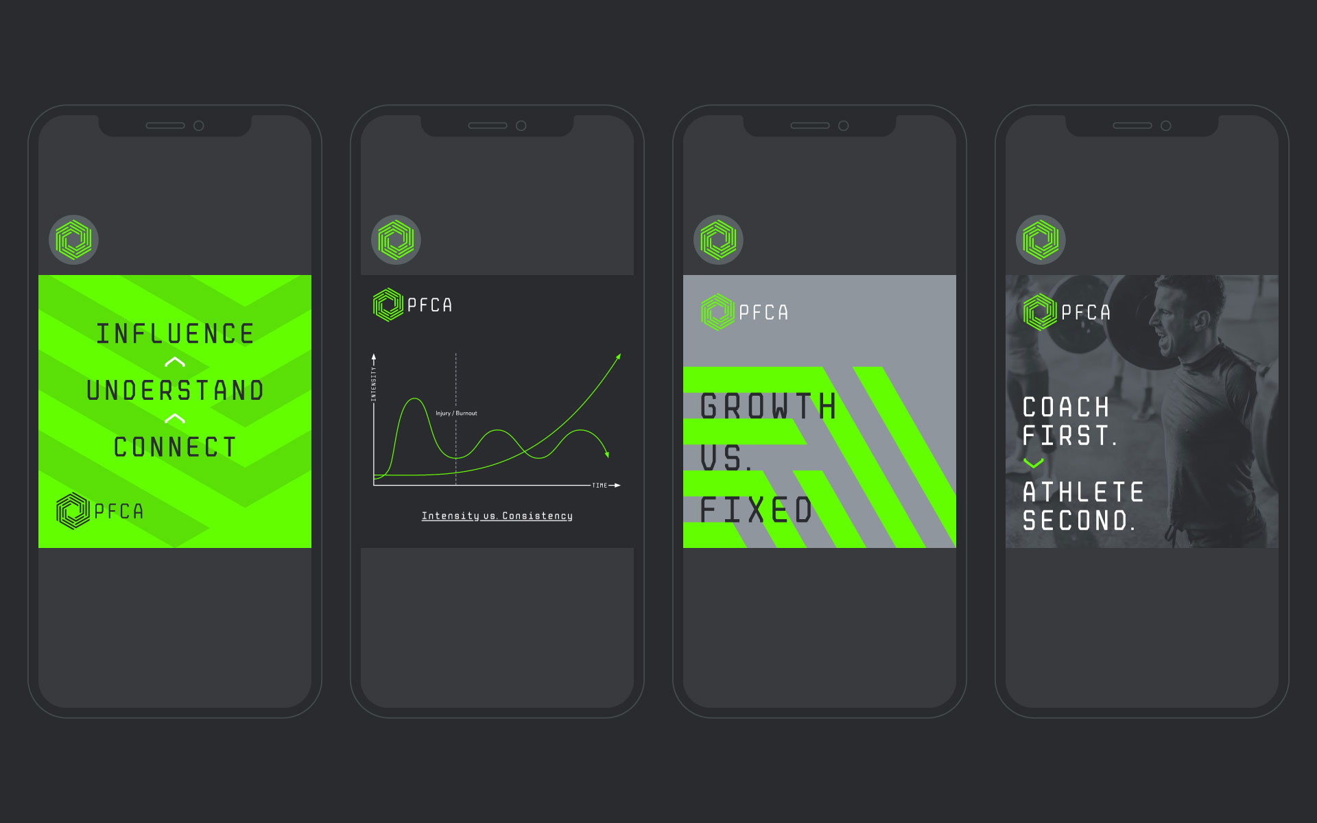
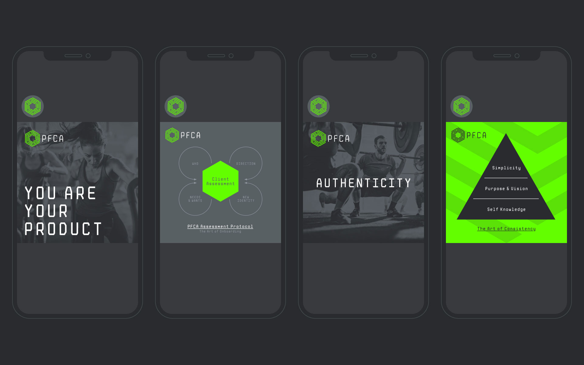
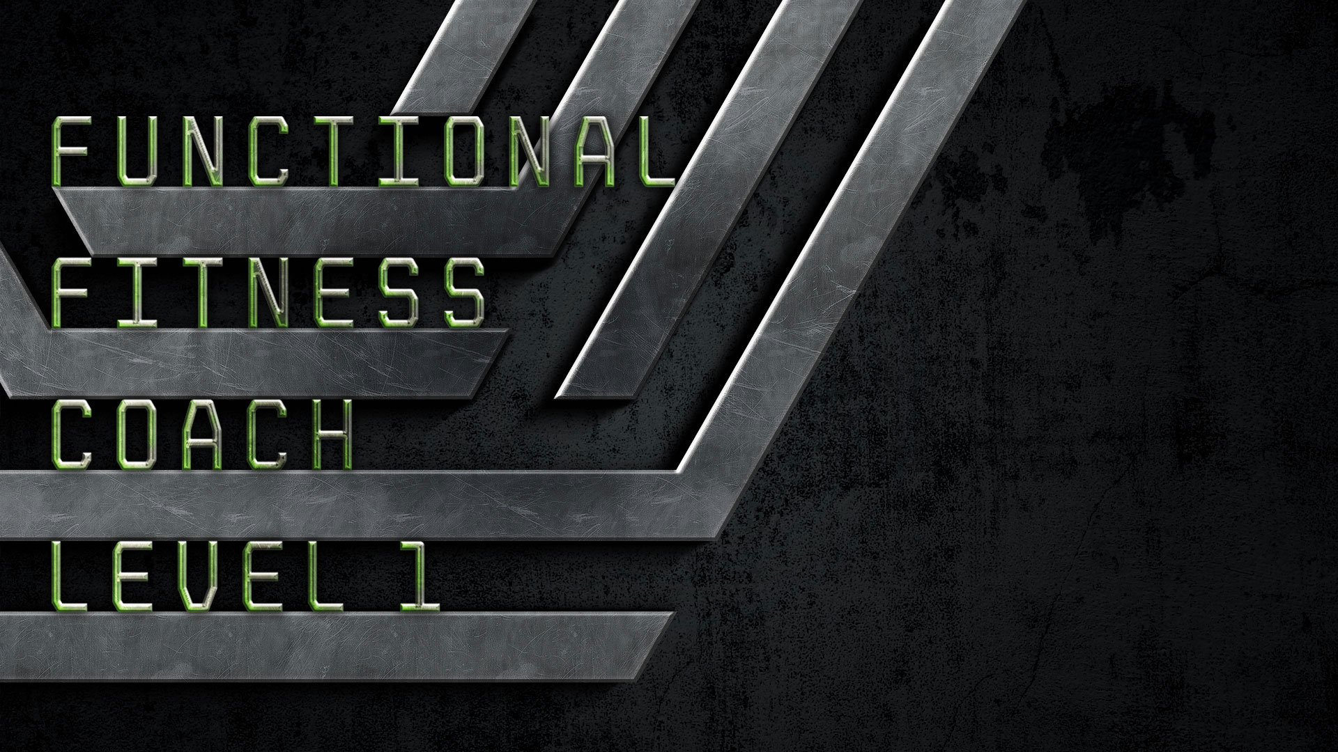
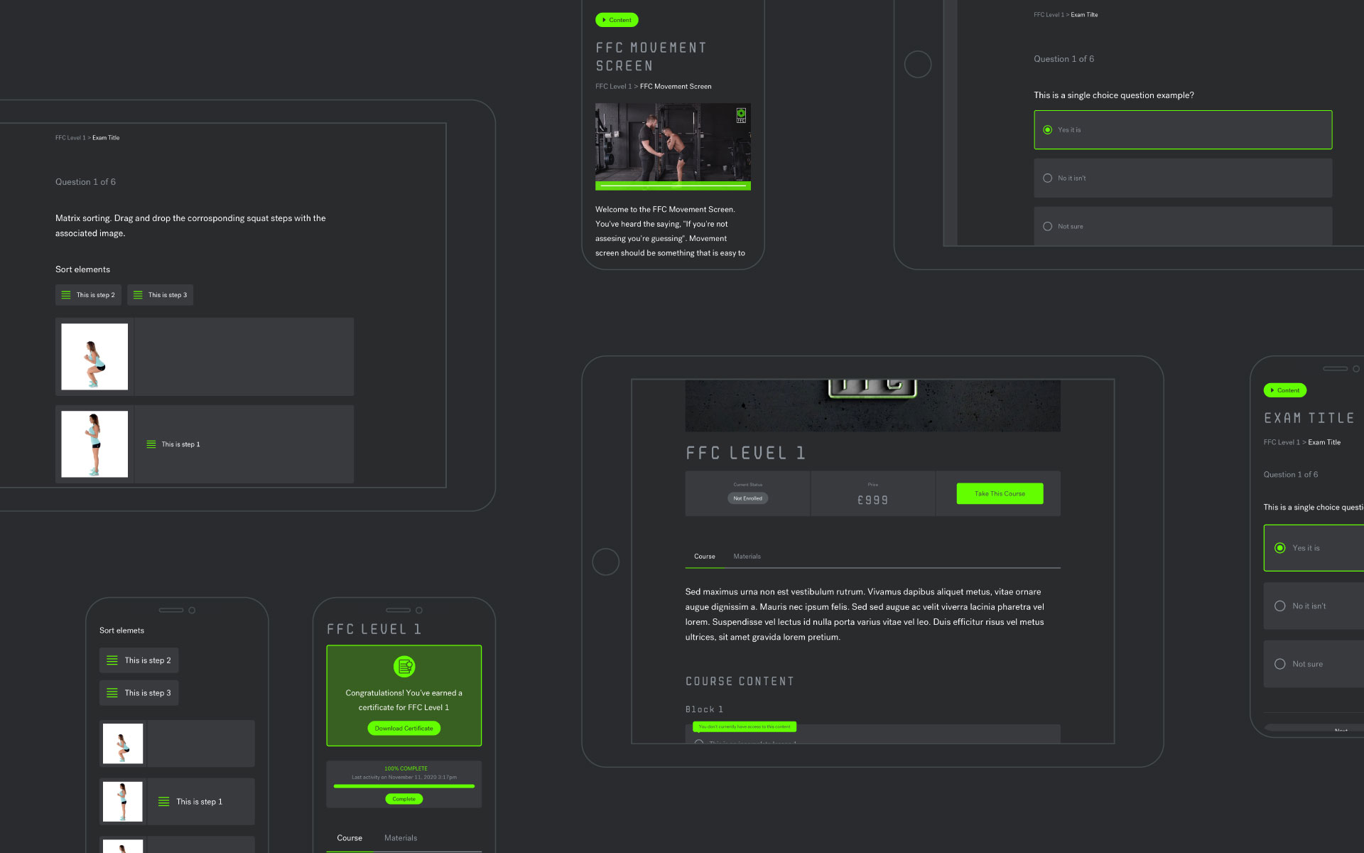
The Functional Fitness Coach (FFC) course is the PFCA's flagship offering. The online syllabus is a comprehensive blend of scientific principles with expert coaching and communication skills.
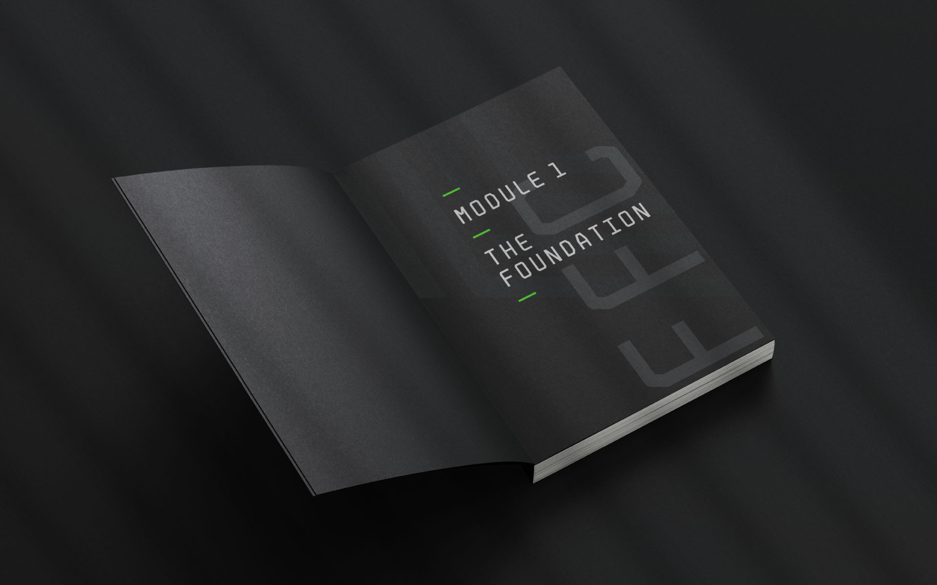
The course is built on the LearnDash LMS and encompasses hours of video learning and written assessments, accompanied by a printed handbook and various other course materials.